Activity Details
The Activity Details toolsheet provides insights into individual process activities, their patterns, and their impact on overall process performance. By analyzing activity-specific data, users can identify correlations, detect timeline patterns, and understand the contextual influence of selected events. The sheet highlights how specific activities affect process lead times and uncovers dependencies between related events. This enables users to spot inefficiencies, reduce unwanted activities, and stabilize process durations for improved operational outcomes.
Type: Tool Sheet
Getting here
The Activity Details Sheet is available in the list of Sheets from the Sheets tab on the Template App. When you first open it, no activity is selected, so there will be no data in the visualizations. You will have to select a specific Activity to analyze.
Alternatively, if you click on any node in the Process Analyzer, the node popup window will appear. At the bottom on the rigth side of said window is a link that will take you the the Activity Details sheet with this particular selection.
Key Figures
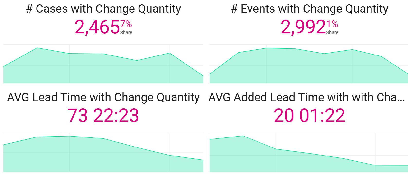
# Number of Cases with Change Activity
- Shows the number of cases with this particular change activity. Change events usually indicate rework, so the ideal situation would have a low number.
# Events with Change Activity
- Ideally, this number would be low.
Average Lead Time with Change Event
- This indicates the average amount of lead time in all cases with this Activity. This figure should be low.
Average Added Lead Time with Change Event
- This indicates the average amount of extra (added) lead time in cases with this Activity as compared to those without it. This figure should be low.
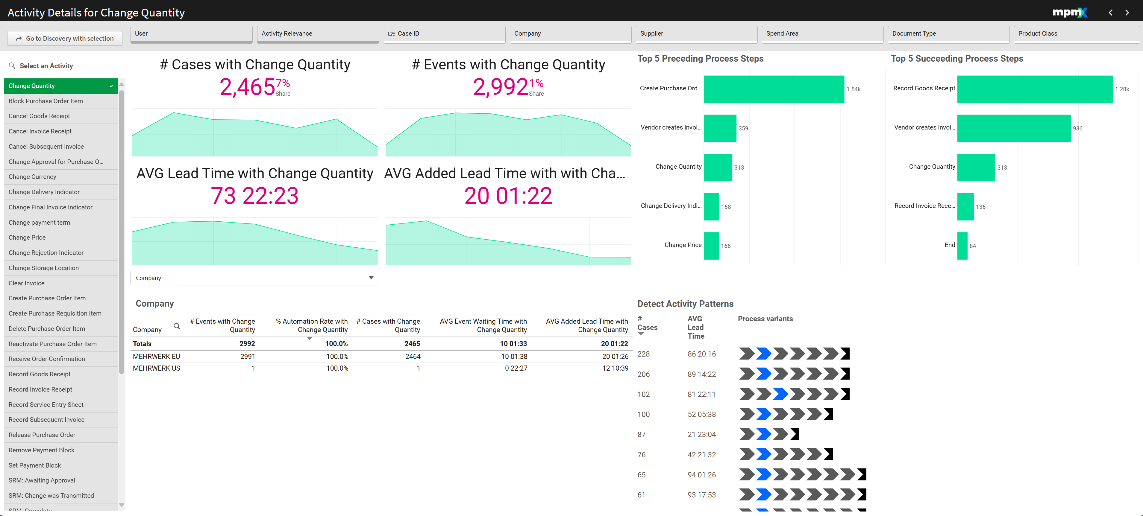
Analyze Activity Characteristics by [Dimension] | Table
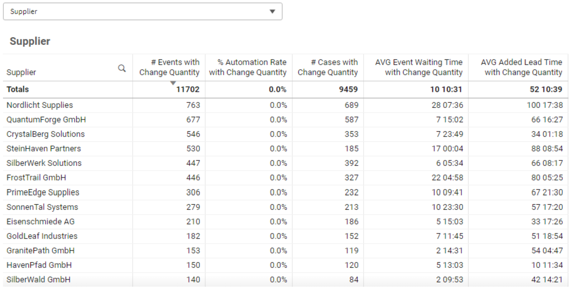
In the bottom left is a table that shows key figures for the dimension selected in the dropdown, such as Supplier. Sort the content by clicking a column header (e.g. Change Events, Automation Rate, or Waiting Time, etc.) to:
- Identify negative outliers that might need improvement.
- Highlight positive examples to understand and replicate their success.
Sometimes multiple factors must be considered:
- A high number of Change Events may be acceptable if the Automation Rate is also high, as automated changes don’t consume manual effort.
- In contrast, even a lower number of Change Events could result in long lead times if they are handled manually.
Top 5 Preceding & Succeeding Process Steps | Bar Chart
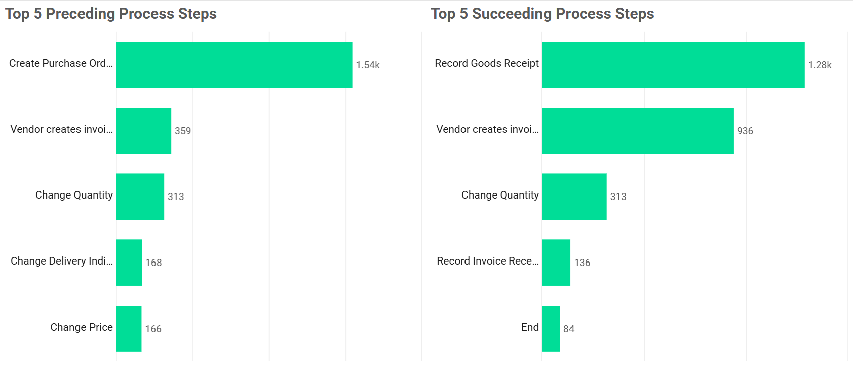
These charts reveal the most common steps before and after the selected activity. They help uncover structural issues in the process.
If the Price Change usually occurs right after the Purchase Order was created, then this indicates a Master Data problem (the price list needs updating).
If Price Change is usually followed by a Change in Quantity (e.g. price change goes up, quantity goes down) then this is not good for the purchasing process. Prices have to be reliable for the customer to budget how many items they can afford to buy.
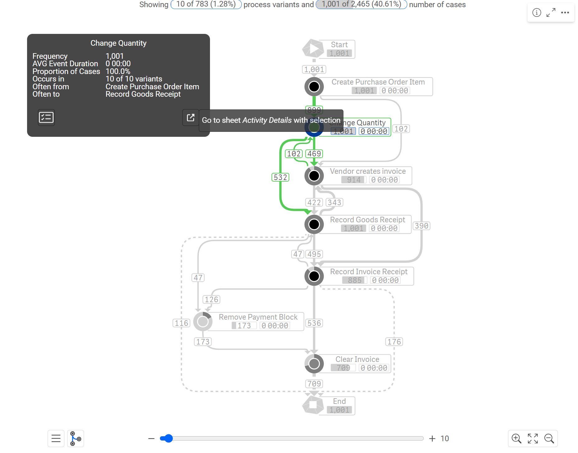
Process Variants Inspector
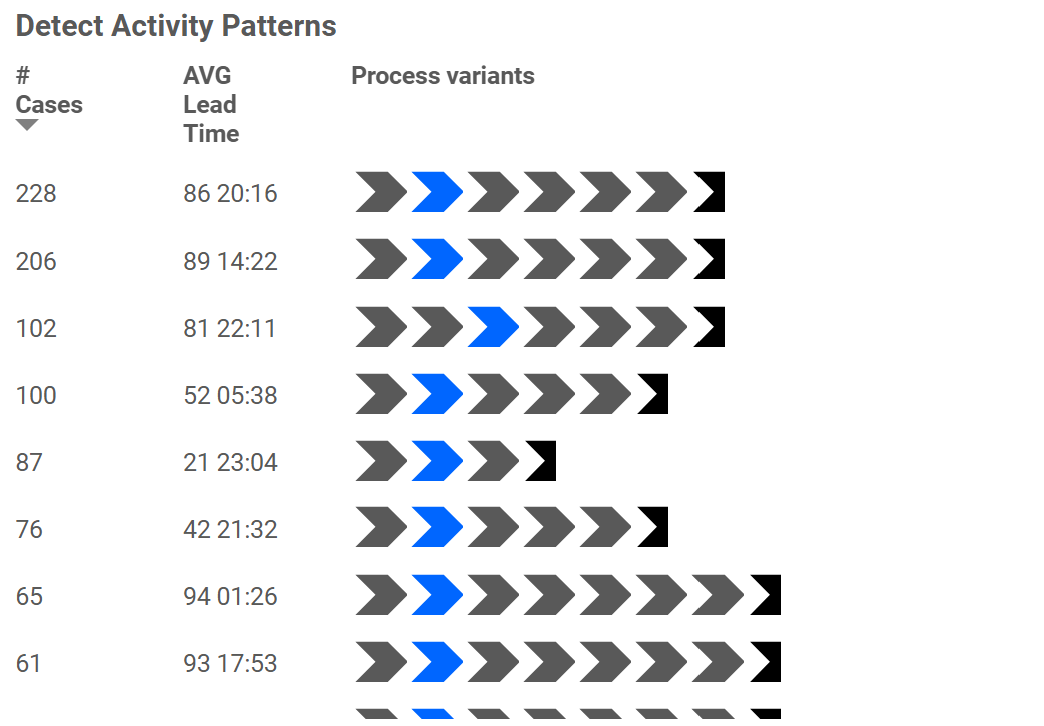
In the bottom right corner, the Process Variants Inspector visualizes how the selected activity appears across different process flows. The blue arrows show the selected activity as it occurs in the different process variations. You can see the common process paths that occur before and after the activity.
If the activity "Price Change" appears early, it may point to structural issues in the process design.
If it occurs midway, it could indicate communication or coordination problems between departments or systems.